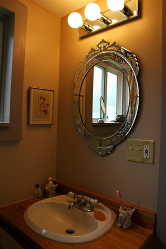
Over the bathroom basin we are installing a mirrored 3 light vanity fixture to go with the 1930’s engraved style mirror I picked up from Lowe’s for $34, and framed with a gray picture frame ($24.) to match the grey trim. I replaced that one with the one shown in this photo for about $68.00 and used the other mirror in the kitchen.

This toned down grey and brown treatment for the bathroom has a very modern spa feel to it. Coupled with the new light fixtures (which one visitor to the house termed “classy” ha ha!) and a new lighted fan should emphasize the house's many water features - it’s koi pond out front and backyard gazebo housing a large wood hot tub (4 people comfortably). It always feels like you are being gently boiled by some good witch when out in the gazebo soaking after a long day working.
A great rule for staging a house for sale is:
“perfect -- where you look, and where you touch”
in otherwords it is worth your time and effort to detail those places in house where you first look and then are likely to touch. Kitchens and bathrooms are the most likely to be grungy and also are very important when refinishing a house to sell.

Both men and women are focused on the kitchen and bathroom of the house being livable and usable – upon moving in, and that means immaculately clean and perfect. It is true that smaller places require more time to detail, and small bathrooms are extremely important to detail out with spackle, sanding, and painting. Nothing should draw attention to itself and the focus should be gently directed to the room’s best features – in this case the giant Jacuzzi tub.
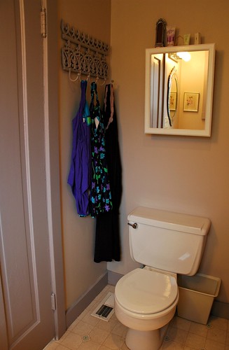
One interesting thing I corrected - with this house’s bathroom the light shines directly down on the door showing every bump and surface irregularity. If the door was new or had not much use and fewer levels of paint it would be easy to make it look good, but of course this is not the case here. The solution? Paint the inside of the door brown-grey to go with the trim! It hides the many flaws of the door and still maintains the modern spa appeal.
As part of the spa look we took the old standard mirrored cabinet from over the sink and painted it several layers of semi-gloss pure white. In the back of the cabinet I cut out and placed a piece of the toile wallpaper and set the shelves back into the cabinet, and placed it onto the wall above the toilet. The toile is a sweet visual surprise to anyone opening the cabinet!
What’s next? Painting the wall sizing for the wallpaper in the stairwell and small hallway, where the new bowl shaped African trading bead inspired light fixture illuminates the area in a warm glow. Completing the trim and corners in the last upstairs room.
Bowl shaped lighting fixtures have a certain positive Feng Shi aspect to them, of encouraging freeflowing energy and also wealth, as the bowl is full of light. As the top light fixture in the most private recess of the house, I think it is an excellent choice for many reasons.

Yesterday we also had a tourist – a woman who works as a children’s advocate who came to see the progress – it is interesting to see that as a project comes closer to completion people can begin to visualize what the additional goodies, like wallpaper will mean to the completed project.
Jeanette also helped keep us focused on the right design path – when we found a lovely nude painting, and spoke briefly about including it as part of the staging she said “what part of French Country Hobbit” is this?” Good point! – it may be perceived as inappropriate by some buyers and it does not suit the mood of the presentation. So we stick to the original design!
Renovation
Seattle
No comments:
Post a Comment